
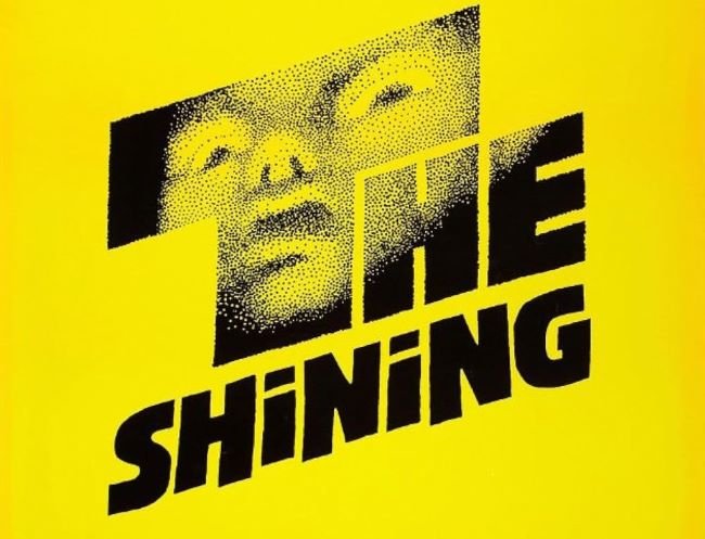
The Shining font achieves something genuinely rare in horror design: it terrifies through restraint rather than spectacle. Stanley Kubrick’s 1980 title sequence deploys a bold, geometric sans-serif with an almost clinical coldness — no texture, no decay, no gothic flourishes, just perfectly composed blocky lettering against absolute darkness. That deliberate lack of ornamentation is precisely what makes it so unsettling; the typography feels as controlled and as wrong as the Overlook Hotel itself. The fan-made Shining NFI demo captures this distinctive look faithfully for personal use projects.
What this typographic approach teaches designers is that dread doesn’t require distressing — sometimes a clean, heavy, geometric face set with perfect precision is more disturbing than any cracked or bleeding letterform could be. It translates powerfully to psychological thriller book covers, horror game interfaces, escape room branding, sinister corporate parody aesthetics, or any project where the goal is to make something look absolutely normal and feel deeply wrong at the same time.
You might like these fonts:
Explore these striking typefaces including Toy Story Font, Up Font, and Incendies Font.
Important!
Fonts on this site are property of their creators and may be freeware, open-source, or public domain. License info shown is for guidance only. Check readme files or author websites for details. Missing info doesn’t mean the font is free to use.
Found an error or copyright issue? Please report it.


