
Learn how after effects kinetic typography works, from core techniques and tools to font choices and real kinetic typography examples…
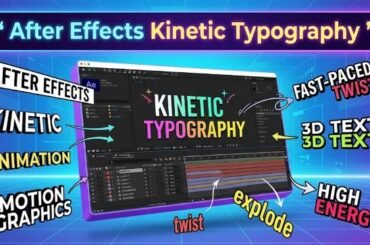
Learn how after effects kinetic typography works, from core techniques and tools to font choices and real kinetic typography examples…
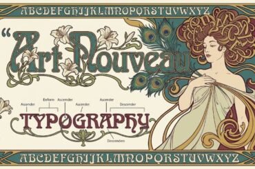
Explore art nouveau typography — its history, defining visual characteristics, how to recognize it, and which art nouveau fonts work…
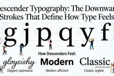
Discover what descender typography is, how descenders and ascenders shape readability and font choice, and why these letterform details matter…
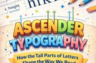
Learn what ascender typography means, how ascenders and descenders affect readability and type selection, and why these letterform details matter…
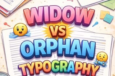
Learn the difference between widow vs orphan typography, why both hurt readability, and how to fix them in print and…

When it comes to using up supplies in your shop, you should always use the newest supplies first — is…
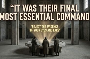
“It was their final, most essential command” appears in George Orwell’s 1984 as part of one of the most disturbing…
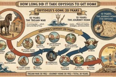
If you’ve ever asked how long did it take Odysseus to get home, the short answer is 20 years. Ten…
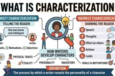
One way an author uses direct characterization is by telling the reader about the character through a narrator’s description, another…
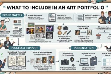
Putting together an art portfolio is one of those tasks that feels straightforward until you’re actually doing it. Suddenly you’re…
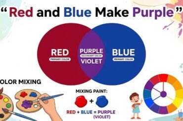
The short answer is yes, red and blue make purple. Mix the two together and you’ll get some version of…
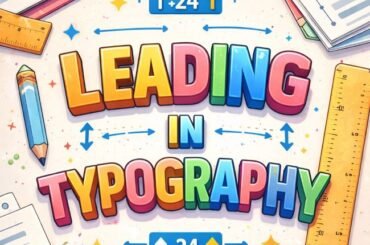
Understand leading in typography — what it is, how it works, and how to set it correctly for body text,…
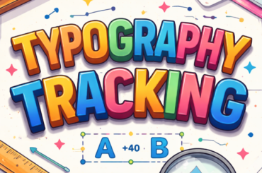
Learn the typography tracking definition, how tracking differs from kerning, and when to use each — a practical guide for…
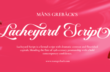
Lacheyard Font is a calligraphic script typeface by Måns Grebäck that carries the elevated, composed elegance this designer is known…
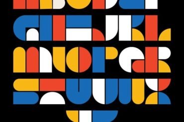
Neo Font by Surat-based designer Kunal Patel is a geometric sans-serif built with brand identity work in mind. Clean and…