
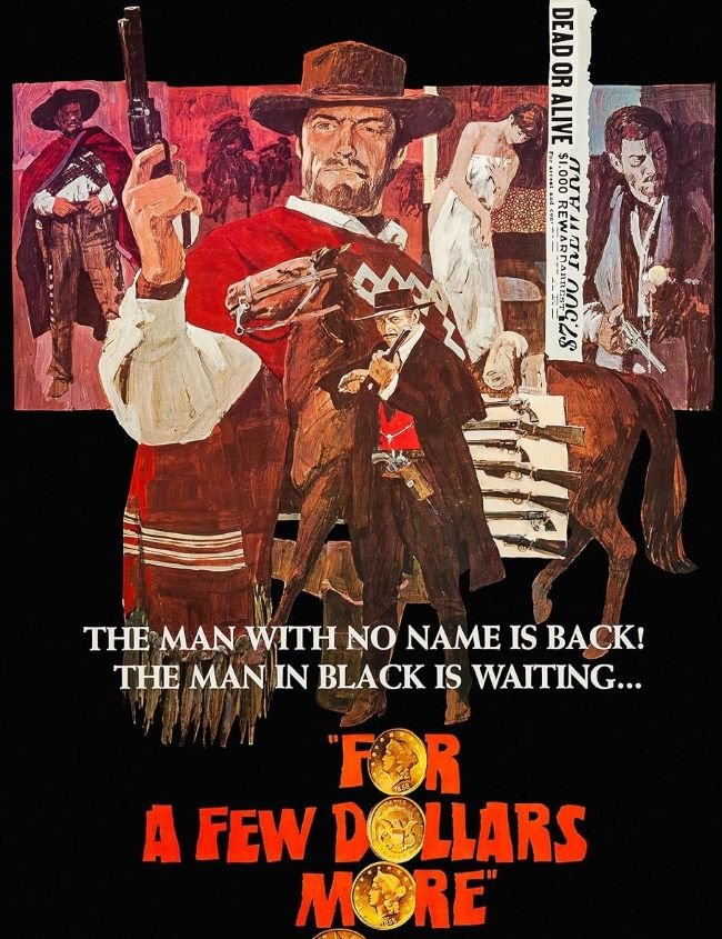
For a Few Dollars More font belongs to the grand tradition of the Spaghetti Western title card — a typographic genre that Sergio Leone essentially invented across his 1960s trilogy, where the letterforms had to carry the same mythic weight as the landscapes and the silences. The 1965 film’s poster and title lettering draws on Egyptian slab-serif and condensed Western display traditions: heavy, block-like structures with thick serifs that evoke hand-painted signs, wanted posters, and the kind of typography that was set in hot lead by someone who needed it to be readable from across a dusty plaza. The freely available Chester Network captures that same weathered, slab-serif authority.
You might like these fonts:
Explore these striking typefaces including Cygre Typeface Font, Hypik Font, and Gummy Bear Font.
Important!
Fonts on this site are property of their creators and may be freeware, open-source, or public domain. License info shown is for guidance only. Check readme files or author websites for details. Missing info doesn’t mean the font is free to use.
Found an error or copyright issue? Please report it.


