
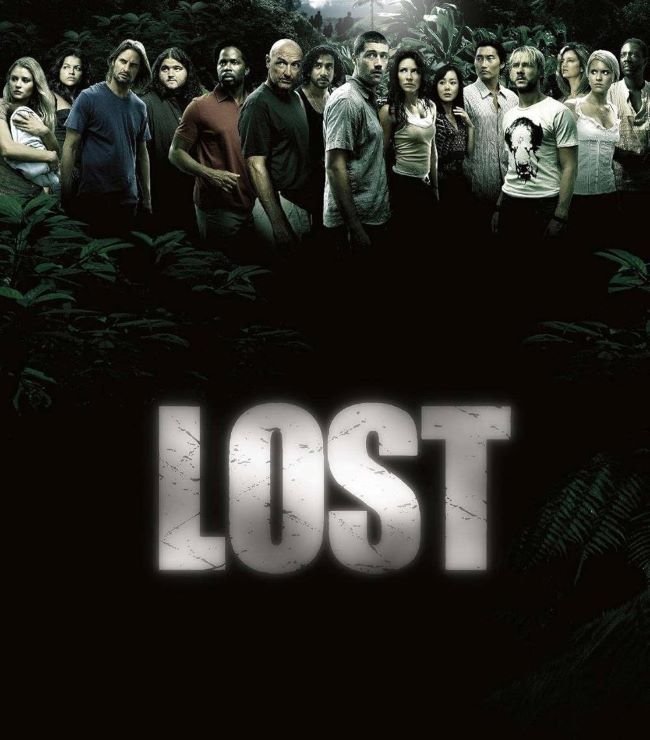
Lost font made one of the boldest design statements in television title history by reducing itself to almost nothing — a single word in heavy sans-serif capitals, white on black, zooming toward the viewer and snapping to a stop with a percussive sound effect that became as iconic as the word itself. J.J. Abrams and Damon Lindelof’s 2004 ABC series needed title typography that could carry an entire mystery in four letters, and the clean, undecorated approach delivered it: the simplicity makes the word feel like a transmission, a statement of fact, and a question simultaneously. Two alternatives reconstruct this stark, high-contrast bold sans-serif register: Alternative 1 and Alternative 2.
You might like these fonts:
Explore these striking typefaces including The Diplomat Font, Indiana Jones Font, and Oracle Font.
Important!
Fonts on this site are property of their creators and may be freeware, open-source, or public domain. License info shown is for guidance only. Check readme files or author websites for details. Missing info doesn’t mean the font is free to use.
Found an error or copyright issue? Please report it.


