
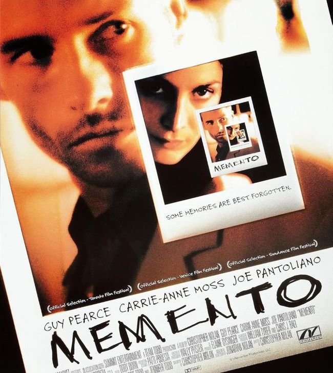
Memento font refuses to behave — and that’s entirely the point. Christopher Nolan’s 2000 psychological thriller told its story in reverse, fragmenting time and trust in equal measure, and the poster’s raw, distressed letterforms reflect that same deliberate disorientation. Uneven, textured, and scrawled with the urgency of someone who can’t trust their own memory, the typography is less a design choice and more a state of mind. The freely downloadable Jopea captures a closely comparable handwritten roughness for designers who want to work directly in that unsettled register.
For creative work that demands rawness over refinement — indie film posters, experimental editorial layouts, psychological thriller branding, or zine-style projects where imperfection is the message — this typographic direction is genuinely irreplaceable. There’s a kind of honesty in distressed letterforms that polished type can never achieve, and Memento understood that perfectly: sometimes the most truthful thing a font can do is look like it’s barely holding itself together.
You might like these fonts:
Explore these striking typefaces including TikTok Sans Font, Zaychik Font, and Pretendard Font.
Important!
Fonts on this site are property of their creators and may be freeware, open-source, or public domain. License info shown is for guidance only. Check readme files or author websites for details. Missing info doesn’t mean the font is free to use.
Found an error or copyright issue? Please report it.


