
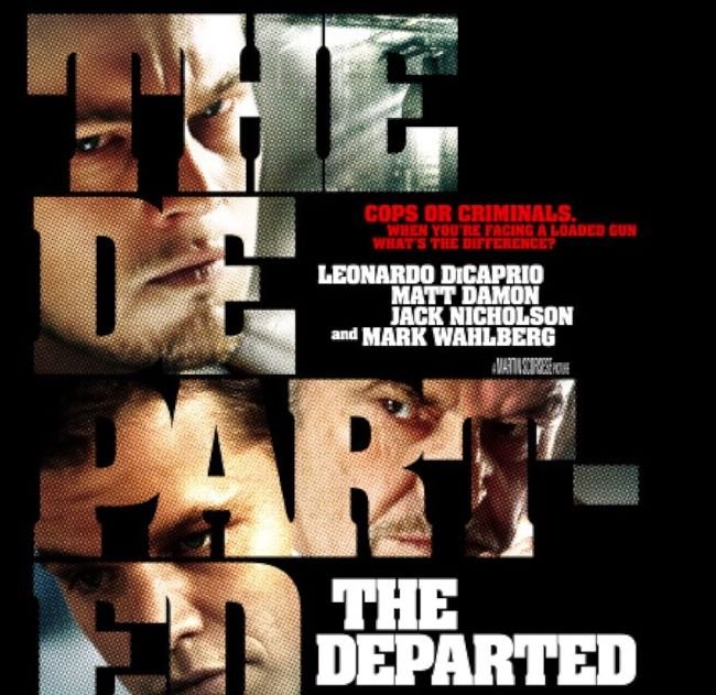
The Departed font pulls no punches — bold, condensed, and built for maximum impact in minimum space, it perfectly mirrors the unsparing energy of Martin Scorsese’s 2006 crime masterpiece. The title design draws inspiration from heavy condensed sans-serifs in the tradition of Aachen Bold and Compacta Bold, typefaces long favored in movie poster design for their commanding presence. Two freely downloadable alternatives carry that same street-level force: Barlow Condensed Extra Bold and Headlines Bold, both delivering the tight, aggressive geometry that defines the look.
This typographic approach is built for pressure — it thrives in urban settings, crime thriller posters, magazine covers, and any design context where the work needs to communicate toughness and urgency from across the room. Just as the film navigates loyalty and betrayal with ruthless efficiency, this style of letterform strips away anything unnecessary and leaves only what hits hardest.
You might like these fonts:
Explore these striking typefaces including Bobert Font, Blue Curve Font, and Coconat Font.
Important!
Fonts on this site are property of their creators and may be freeware, open-source, or public domain. License info shown is for guidance only. Check readme files or author websites for details. Missing info doesn’t mean the font is free to use.
Found an error or copyright issue? Please report it.


