
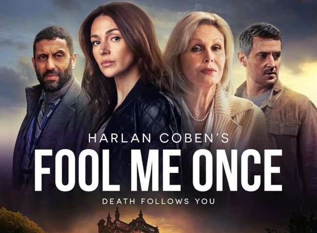
Fool Me Once font mirrors the series itself — clean on the surface, deeply unsettling once you look closer. Netflix’s adaptation of Harlan Coben’s thriller uses a sharp, minimal sans-serif title design that communicates sophistication and suspicion in equal measure; nothing decorative, nothing that tips its hand. The official typeface was never publicly released, but the freely available Bebas Neue channels the same tightly tracked, all-caps confidence that defines the series’ cool and controlled visual identity.
Bebas Neue has become one of the defining display fonts of contemporary streaming aesthetics precisely because it occupies this particular tension — bold enough to command attention, neutral enough to let the content do the threatening. It’s a strong choice for thriller and crime drama title treatments, true crime podcast branding, editorial crime journalism, suspense novel covers, or any project where the design brief could be summarized as: professional, modern, and not entirely trustworthy.
You might like these fonts:
Explore these striking typefaces including Fool Me Once Font, Psycho Font, and Sunset Boulevard Font.
Important!
Fonts on this site are property of their creators and may be freeware, open-source, or public domain. License info shown is for guidance only. Check readme files or author websites for details. Missing info doesn’t mean the font is free to use.
Found an error or copyright issue? Please report it.


