
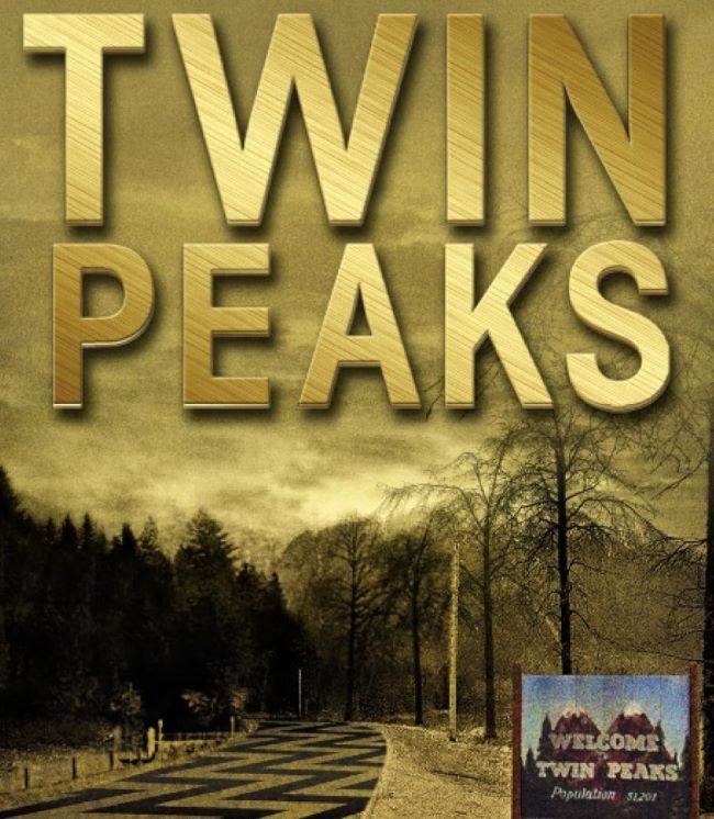
Twin Peaks font occupies a very specific and unrepeatable typographic territory — the rustic American Pacific Northwest serif tradition made deeply, inexplicably strange by David Lynch and Mark Frost’s 1990 television masterpiece. The title lettering is a bold, wood-grain-adjacent serif with the quality of a sign painted by someone who knew their town was not entirely what it appeared: solid, legible, and warm on the surface, with something unsettling happening in the spacing and weight that you can’t quite put your finger on. Three alternatives approach this simultaneously comforting and uncanny register from different angles: Alternative 1, Alternative 2, and Alternative 3.
Twin Peaks established a visual language for a very particular kind of American uncanny — the diner, the log, the douglas fir, the cherry pie, the plastic-wrapped body — and the typography is part of that language, lending the familiar enough weight and warmth to make what lurks beneath it all the more disturbing. For designers working on Pacific Northwest brand identity, cozy mystery and dark Americana publishing, cult television tribute design, lodge and cabin hospitality branding, or any project where the goal is to make something feel simultaneously welcoming and deeply wrong in a way the viewer can’t articulate, this is the essential typographic reference point.
You might like these fonts:
Explore these striking typefaces including Stay Puft Font, OCR B Font, and Oraqle Script Font.
Important!
Fonts on this site are property of their creators and may be freeware, open-source, or public domain. License info shown is for guidance only. Check readme files or author websites for details. Missing info doesn’t mean the font is free to use.
Found an error or copyright issue? Please report it.


