
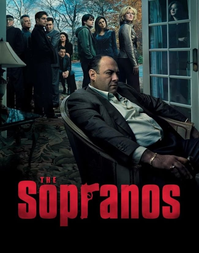
The Sopranos font carries the specific weight of New Jersey Italian-American working-class life that David Chase insisted on for every element of HBO’s landmark 1999 series — bold, condensed, and with a slightly weathered quality that places it firmly in the tradition of the kind of signage found on diners, funeral homes, and social clubs in Essex County.
The lettering is not the typography of the Corleones or of Hollywood’s romanticised mob aesthetic; it is the typography of a man who drives an SUV, sees a therapist, and kills people before picking his kids up from school, which is exactly what makes it remarkable.
You might like these fonts:
Explore these striking typefaces including Stay Puft Font, OCR B Font, and Oraqle Script Font.
Important!
Fonts on this site are property of their creators and may be freeware, open-source, or public domain. License info shown is for guidance only. Check readme files or author websites for details. Missing info doesn’t mean the font is free to use.
Found an error or copyright issue? Please report it.


