
Learn what ascender typography means, how ascenders and descenders affect readability and type selection, and why these letterform details matter more than you think.
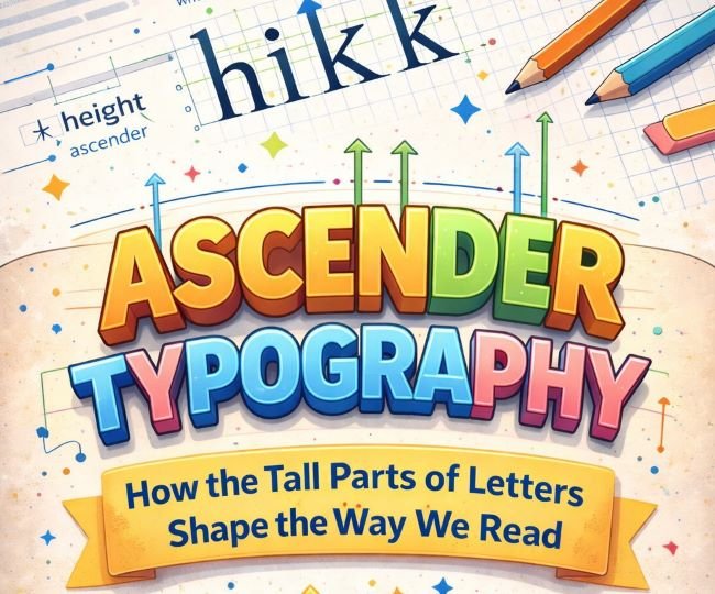
Look at the word “highlight.” Notice how the “h,” “i,” “g,” and “l” reach above the other letters? Those upward strokes are ascenders, and they do more work in ascender typography than most people realize. They give words their silhouette, help us recognize text at a glance, and quietly influence decisions about line spacing, font pairing, and type size. If you’ve ever wondered why two fonts at the same size look completely different in a layout, ascenders are often a big part of the answer.
This post breaks down what ascenders are, how they relate to descenders, and why both matter for anyone working with type.
What Are Ascenders in Typography?
An ascender is the part of a lowercase letter that extends above the x-height. The x-height is the height of a typical lowercase letter with no extending strokes, using the letter “x” as the reference point since it sits squarely within the main body of the text.
Letters with ascenders include: b, d, f, h, i, j, k, l, and t. The strokes on these letters that reach upward past the x-height are the ascenders. In some typefaces, these strokes reach all the way to the cap height (the height of uppercase letters). In others, they go even higher.
That last point is worth pausing on. In many classic text typefaces, the ascenders on lowercase letters are actually taller than the capital letters. This is intentional. Designers do it because it creates a more natural, less mechanical rhythm in running text. When ascenders and capitals are the same height, the text can feel rigid and uniform. When ascenders are slightly taller, the text has more organic movement.
What Are Descenders in Typography?
Descenders are the counterpart to ascenders. Where ascenders reach up, descenders drop below the baseline. The baseline is the invisible line that letters sit on.
Letters with descenders include: g, j, p, q, and y. The strokes that hang below the baseline are the descenders. In some fonts the descenders are long and elegant; in others they’re cropped short to fit tighter line spacing.
Ascenders and descenders together give words their distinctive shapes. When you read, you don’t actually process each letter individually. You recognize the overall shape of a word as a unit. Ascenders and descenders contribute to that shape, which is part of why ALL CAPS text is harder to read in long passages. Capital letters don’t have descenders, and they rarely have ascenders, so the words become uniform rectangles with no distinguishing silhouette.
Ascender Height and X-Height: Why the Ratio Matters
The relationship between the ascender height and the x-height is one of the most important characteristics of any typeface. Different ratios produce very different reading experiences.
High x-height, short ascenders: The lowercase letters are large relative to the uppercase. This makes the font feel open and legible at small sizes, which is why many screen fonts are designed this way. The trade-off is that the text can feel a little flat or modern, lacking the classical elegance of fonts with taller ascenders.
Low x-height, tall ascenders: The lowercase letters are smaller relative to the line height, and the ascenders stretch significantly. This creates a more graceful, literary feel. Many traditional book typefaces and serif fonts designed for print fall into this category. They can be harder to read at very small sizes but feel authoritative and refined at body text sizes and above.
Balanced ratio: Most workhorse text fonts land somewhere in the middle, with an x-height and ascender height designed to handle a wide range of uses without pushing too far in either direction.
When you’re choosing a font, look at how the ascenders and x-height relate. A quick way to judge this is to set a word like “happening” which contains both ascenders and descenders, and see how the letters interact with each other and with the space around them.
How Ascenders Affect Line Spacing
Ascenders and descenders directly influence how much line spacing (leading) a typeface needs.
A font with very long ascenders and descenders needs more vertical space between lines. If the descenders of one line come too close to the ascenders of the line below, the text feels cramped and the strokes can visually collide. A font with short ascenders and descenders can sit more tightly without that problem.
This is one reason you can’t just copy a line spacing value from one font and apply it to another. Each typeface has its own proportions, and what works for one will often look wrong on another.
If you’re setting body text in a font with generous ascenders and you notice that your line spacing feels off even at standard values, try increasing the leading slightly. The ascending strokes need room above them to breathe, not just the cap height.
Ascenders and Descenders in Font Pairing
When you pair two fonts, their ascender heights and x-heights need to be considered, not just their visual style.
Two fonts with very different x-heights will look mismatched at the same point size, even if they share a similar aesthetic. One will look large and dominant while the other looks small and secondary. This is sometimes intentional in display pairings, but in body text contexts it usually creates inconsistency.
A useful pairing strategy is to find fonts whose x-heights are similar, then let the ascender differences add visual interest. This gives the pairing coherence at the word level while the different ascender treatments contribute personality.
For example, a serif body font with tall, elegant ascenders can pair well with a sans-serif heading font that has a higher x-height, because the difference in proportions creates contrast between the heading and body roles while both still feel balanced on the page.
If you’re working on a project that calls for a typeface with distinctive ascender character, Lobster is a strong example of a font where the ascenders are a major part of its personality. The sweeping strokes that extend above the x-height give it its signature look.
Descender Typography in Practice
Descender typography, like ascender decisions, comes up in practical situations more often than you’d expect.
Logo and wordmark design: Descenders in a logo can extend below the baseline of the containing shape, which creates alignment decisions. Some designers clip the descenders to fit a geometric constraint; others let them hang free as a feature. Either approach can work, but it needs to be deliberate.
Tables and tight layouts: In data-heavy contexts like tables, the descenders on letters like “g” and “y” can create visual clutter if the line spacing is too tight. Bumping up the row height slightly so descenders have room is a small adjustment that makes a table much easier to scan.
All-caps settings: When you set text in all capitals, the descenders disappear along with the ascenders. This changes the line spacing needs because the tall vertical range of mixed-case text is gone. All-caps text can often sit at tighter line spacing without feeling cramped, precisely because ascenders and descenders are no longer competing for space.
Reversed-out text: Light text on dark backgrounds tends to look better with fonts that have moderate ascender and descender lengths. Very long extending strokes can look fragile or create optical noise against a dark field.
Choosing Fonts Based on Ascender and Descender Characteristics
When you’re evaluating a font for a project, here’s a practical checklist based on ascender and descender behavior:
- Set a test paragraph with letters that include ascenders (h, l, k) and descenders (g, p, y) and look at how they interact with surrounding lines.
- Check whether the ascenders overshoot the cap height, and decide whether that elegance fits your project or feels out of place.
- If the font will be used at small sizes on screen, favor a higher x-height even if it means shorter ascenders.
- If the font is for editorial or long-form print use, longer ascenders and a lower x-height will often give the text a more refined feel.
- In tight layouts (tables, captions, UI labels), look for fonts with controlled descender length so the strokes don’t create spacing problems.
A typeface like Baloo 2 is a good example of a font with a high x-height and contained ascenders, making it well-suited to UI and screen use where clarity at smaller sizes matters more than classical proportion.
Key Takeaways
- Ascenders are the parts of lowercase letters that extend above the x-height. Common ascender letters include b, d, h, k, l, and t.
- Descenders are the strokes that drop below the baseline, found in letters like g, j, p, q, and y.
- The ratio of ascender height to x-height shapes a typeface’s personality: tall ascenders read as elegant and literary; high x-heights with short ascenders read as open and screen-friendly.
- Ascenders and descenders affect line spacing needs. Fonts with long extending strokes need more leading.
- In font pairing, matching or deliberately contrasting x-heights is more important than most designers realize.
- Practical situations where ascender and descender decisions matter include logos, tables, all-caps settings, and reversed-out text.
Ascenders are easy to overlook when you’re caught up in choosing a font based on style or mood. But once you start seeing how they affect the vertical rhythm, legibility, and spacing of text, you’ll check for them every time.


