
Discover what descender typography is, how descenders and ascenders shape readability and font choice, and why these letterform details matter in real design work.
Type the word “typography” and look at it. The “y,” “p,” and “g” all dip below the line that the other letters sit on. Those downward strokes are descenders, and descender typography is the study of how those strokes behave, how long they reach, and how they interact with everything around them. It sounds like a narrow detail, but descenders touch almost every decision you make about spacing, font selection, and layout. Once you understand them, you’ll see them everywhere.
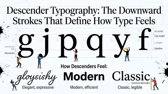
What Is a Descender in Typography?
A descender is the portion of a lowercase letter that extends below the baseline. The baseline is the invisible horizontal line that letters sit on when you read a line of text.
Not every letter has a descender. The ones that do include: g, j, p, q, and y. In some typefaces, the lowercase f also has a descending tail, and certain italic or script letterforms extend additional strokes below the baseline.
The length of the descender, measured from the baseline down to the lowest point of the stroke, is called the descender length or descender depth. This measurement varies considerably from one typeface to another, and it has a direct effect on how a font behaves in a layout.
Descenders and the Type Anatomy They Belong To
To understand descenders fully, it helps to see them as part of the broader vertical structure of a typeface. Every font has a set of invisible horizontal reference lines:
- Baseline: Where letters sit. Descenders drop below this.
- X-height: The top of a standard lowercase letter like “x” or “a.” Most of the lowercase alphabet lives between the baseline and the x-height.
- Cap height: The top of uppercase letters like “H” or “T.”
- Ascender line: The height that ascending strokes on letters like “h,” “l,” and “k” reach toward. This is the domain of ascender typography.
- Descender line: The lowest point that descending strokes reach. This sits below the baseline.
The space between the descender line and the ascender line (or cap height) is the full vertical range of the typeface. Fonts that use a lot of this range feel lively and dynamic. Fonts that keep everything close to the x-height feel compact and utilitarian.
Short vs Long Descenders: What the Difference Looks Like
Descender length is one of the most personality-defining characteristics of a typeface, and it’s something many people sense without being able to name.
Long descenders give type an elegant, classical, or literary quality. You see them in serif typefaces designed for book typography, magazine editorial work, and formal print contexts. A long descender on the “g” or “y” has a graceful sweep that adds rhythm to the text. The trade-off is that these fonts need more line spacing to prevent the descenders from getting too close to the ascenders of the line below.
Short descenders produce a more compact, sturdy feel. Many sans-serif typefaces designed for screen use have trimmed descenders to allow for tighter line spacing and better performance at small sizes. They sacrifice some elegance for practicality, which is exactly the right trade-off in a UI or app context.
Neither approach is better. They’re suited to different jobs. A font with long, flowing descenders is probably a poor choice for a data table. A font with cropped descenders will feel lifeless in a long-form essay.
How Descenders Affect Line Spacing
This is where descender typography becomes very practical very fast.
Line spacing (also called leading) sets the distance between the baseline of one line of text and the baseline of the line above it. When you increase line spacing, you create more room between lines. When you decrease it, the lines sit closer together.
Descenders eat into that space from below, just as ascenders eat into it from above. A font with long descenders needs more line spacing than a font with short ones, even at the same point size. If you don’t account for this, the descenders of one line will visually crowd the ascenders of the line below, making the text feel cramped and hard to follow.
This is one of the most common spacing mistakes designers make when switching between fonts. A line spacing value that worked perfectly for one typeface can look wrong on another because the descender lengths are different. Always test spacing using words that contain descending letters. “typography,” “playing,” “quickly,” and “pygmy” are good test words because they pack multiple descenders into a short string.
Descenders in Logo and Wordmark Design
Descenders create specific challenges and opportunities in logo typography that don’t exist in body text.
When a brand name contains descending letters, those strokes often extend below the baseline of the wordmark. This affects how the logo sits within a containing shape, how much clear space it needs below it, and how it aligns with other elements in a layout.
Some designers handle this by choosing a typeface with minimal descenders, keeping the wordmark compact and geometrically clean. Others lean into the descenders as a design feature, letting the strokes add elegance or movement to the mark.
The decision matters especially when the logo needs to fit inside a fixed-height container, like a navigation bar or an app icon. A wordmark with long descenders needs more vertical clearance than one where all letters sit above the baseline.
If you’re working with script or display fonts for a logo project, pay close attention to how the descenders behave. A typeface like Pacifico has prominent descenders that are part of its character. Those strokes will need to be factored into your spacing and alignment decisions from the start.
Descender Typography in All-Caps and Small-Caps Settings
One of the clearest ways to see how much descenders contribute to readability is to remove them.
When you set text in all capitals, every descender disappears. The words lose their varied silhouettes and become uniform rectangles of varying width. Research on reading has shown that we recognize words partly by their overall shape, and that descenders (along with ascenders) are significant contributors to that shape. All-caps text is harder to read in long passages in part because those shape cues are gone.
Small-caps are a different situation. True small-caps are specially drawn letterforms, not just scaled-down capitals. They typically don’t have descenders either, but because they’re sized and proportioned to blend with lowercase text, the reading experience is smoother than all-caps. The x-height relationship is preserved even without the descending strokes.
For short bursts of text like labels, headings, or abbreviations, all-caps works fine. For anything more than a sentence or two, keeping lowercase letters with their descenders intact is the better choice for readability.
Descenders and Ascenders Working Together
Descenders don’t exist in isolation. Their relationship with ascenders is what creates the full vertical rhythm of a typeface.
A font with both long ascenders and long descenders has a wide vertical range. This gives it elegance and a strong visual presence, but it demands generous line spacing and works best in contexts where there’s room to breathe. Print editorial design, book typography, and premium brand identities are natural homes for this kind of type.
A font with both short ascenders and short descenders is compact and efficient. It fits more content into a given space and handles tight layouts well. UI design, mobile interfaces, and dense data contexts suit this profile.
The interesting middle ground is fonts that combine a high x-height (which implies short ascenders) with long descenders, or vice versa. These less common proportions can create distinctive personalities. A high x-height keeps the text open and legible, while long descenders add movement and refinement below the line.
A contemporary sans-serif like Quicksand balances a relatively high x-height with gentle, proportionate descenders, making it comfortable for both screen and light print use without leaning too far in either direction.
Practical Tips for Working with Descenders
A few things worth keeping in mind whenever descender length is relevant to your project:
- Test line spacing with descender-heavy words before finalizing your layout. “typography” and “playing” reveal spacing issues that “Hello World” never will.
- In tight vertical spaces like buttons, badges, or table cells, check that descenders aren’t getting clipped by the container boundaries. Adding a few extra pixels of bottom padding often fixes this.
- When pairing fonts, compare their descender lengths as well as their x-heights. Two fonts with very different descender proportions can feel mismatched even if they share a similar style.
- In reversed-out text (light on dark), long descenders can look visually heavy against the dark background. A font with moderate descender length often holds up better in these contexts.
- For any logo or wordmark work, isolate the descending letters early and decide whether they’re a feature or a constraint before committing to a typeface.
Key Takeaways
- A descender is the part of a lowercase letter that extends below the baseline. The letters g, j, p, q, and y are the most common examples.
- Descender length varies significantly between typefaces and shapes their overall personality: long descenders feel elegant and literary, short descenders feel compact and practical.
- Descenders directly affect line spacing requirements. Fonts with longer descenders need more leading to prevent visual crowding between lines.
- In logo and wordmark design, descenders create specific alignment and clearance decisions that need to be addressed early.
- Removing descenders (as in all-caps text) reduces the word-shape cues that readers rely on, which is part of why all-caps is harder to read at length.
- The relationship between descenders and ascender typography defines a font’s full vertical range and determines which contexts it suits best.
Descenders are small strokes with a large influence. Getting familiar with them changes how you evaluate fonts, how you set spacing, and how you approach any layout where type plays a central role.


