
Explore art nouveau typography — its history, defining visual characteristics, how to recognize it, and which art nouveau fonts work best for modern design projects.
There’s a category of lettering that feels like it grew rather than was drawn. Curving stems that echo vines, letterforms that flow into ornamental borders, type that seems inseparable from the illustration surrounding it. That’s art nouveau typography, and even though the movement that created it peaked over a century ago, its influence keeps showing up in contemporary design. Understanding where it came from and what makes it work helps you use it with intention rather than just reaching for it because it looks interesting.
Where Art Nouveau Typography Came From
Art nouveau emerged as a broad artistic movement in the late 1880s and ran through roughly 1910. It was a reaction against the industrialization of the Victorian era and the rigid historical revival styles that dominated design at the time. Artists and designers across Europe wanted something that felt alive, modern (for its moment), and rooted in the natural world rather than in classical architecture or Gothic tradition.
The movement went by different names in different countries. In France and Belgium it was Art Nouveau. In Germany it was Jugendstil, meaning “youth style.” In Austria it was the Wiener Secession. In Italy it was Stile Liberty. Each had regional characteristics, but the shared core was the same: organic forms, flowing lines, and a rejection of strict geometric structure.
Typography was central to the movement from the beginning. Poster artists like Alphonse Mucha and Henri de Toulouse-Lautrec didn’t treat type as a separate element dropped onto an image. They integrated letterforms into the composition, letting the type grow from the same visual language as the figures and decorative borders surrounding it. The result was work where you couldn’t easily separate the words from the art.
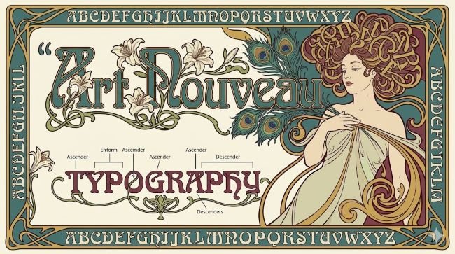
What Defines Art Nouveau Typography Visually
If you’re trying to identify or recreate art nouveau typography, these are the characteristics that define it:
Organic, flowing curves. The most immediate marker. Stems and strokes follow curved, asymmetrical paths rather than straight vertical and horizontal lines. The letterforms feel like they’re in motion.
Whiplash lines. A specific curve type associated with the movement: a long, sinuous line that starts slowly and tightens into a sharp curve at one end, like a cracking whip. You see this in both letterforms and the decorative elements surrounding them.
Nature-based ornamentation. Flowers, leaves, vines, insects, birds, and female figures with flowing hair appear constantly alongside the type. In many art nouveau compositions, it’s hard to tell where the letterform ends and the ornamental illustration begins.
Handcrafted quality. Even when printed at scale, art nouveau type carries the look of something drawn by hand. There’s variation in stroke weight, and the letterforms don’t have the mechanical uniformity of earlier typographic traditions.
High contrast with decorative intent. Stroke contrast (the difference between thick and thin parts of a letter) is often pronounced, but unlike classical serifs where contrast serves readability, in art nouveau the contrast is part of the decorative effect.
Integration with illustration. Art nouveau typography rarely exists as isolated text. It’s designed to live within a larger composition. The type is part of the image, not a label applied to it.
Key Figures and Their Influence on Art Nouveau Fonts
A few designers shaped what we now think of as the art nouveau type tradition.
Alphonse Mucha is probably the most recognized name in the movement. His poster work for the actress Sarah Bernhardt defined the visual language that most people associate with art nouveau: flowing lettering embedded in elaborate decorative borders, surrounded by figures with elaborate hair and natural motifs. His letterforms were drawn specifically for each composition rather than set in existing typefaces.
Otto Eckmann designed the Eckmann typeface in 1900, one of the first attempts to translate art nouveau aesthetics into a repeatable type system. It combined the organic qualities of the movement with enough standardization to be usable in printing. It remains one of the reference points for what an art nouveau font looks like.
Arnold Böcklin lent his name to another typeface from the period, Arnold Böcklin, which became widely used in the early twentieth century and experienced a revival in the 1970s. It’s one of the more recognizable art nouveau fonts with its thick, organic strokes and flowing terminals.
Peter Behrens and the designers of the Vienna Secession took a slightly more geometric approach to art nouveau letterforms, creating a version of the style that bridged the movement with what would later become Art Deco and early Modernism.
Art Nouveau Typography vs Art Deco Typography
These two styles are frequently confused, partly because Art Deco followed directly after Art Nouveau and partly because both involve decorative, stylized lettering.
The key differences:
- Art Nouveau is curved, asymmetrical, and organic. Art Deco is geometric, symmetrical, and structured.
- Art Nouveau draws from nature (plants, animals, flowing water). Art Deco draws from industry and architecture (chevrons, sunbursts, stepped forms).
- Art Nouveau feels handmade. Art Deco feels machined.
- Art Nouveau integrates type into illustration. Art Deco tends to treat type more independently, as a strong graphic element in its own right.
If you’re looking at a piece of decorative lettering and it feels like it could have grown from the ground, it’s probably art nouveau. If it feels like it was precision-cut from steel, it’s more likely Art Deco.
Using Art Nouveau Fonts in Modern Design
Art nouveau typography works well in contemporary design when the context supports it. It carries strong associations: handcrafted, historical, natural, feminine, luxurious, slightly mysterious. These associations are useful in some contexts and distracting in others.
Where it fits well:
- Wellness brands, especially those built around botanical or natural ingredients
- Wine, spirits, and specialty food packaging with a heritage positioning
- Tattoo studio branding and related creative industries
- Music festival and event posters that want a vintage or folk art feel
- Luxury goods where the handcrafted quality of the lettering reinforces product values
- Book covers and editorial work in fantasy, historical fiction, or gothic genres
Where it tends to struggle:
- Tech products and software interfaces (the organic quality works against the precision these contexts require)
- Corporate communications where legibility at small sizes matters
- Fast-moving consumer goods that need to read quickly at a distance
- Any context where the typeface style might overpower the message
The most common mistake with art nouveau fonts is using them for body text. These typefaces are designed for display use: headlines, logos, poster titles, short decorative phrases. At body text sizes, the ornamental qualities that make them interesting become obstacles to reading. Keep them large and give them space.
A font like Carattere captures some of the flowing, calligraphic quality associated with art nouveau letterforms and works well in display contexts where that organic character is an asset.
For projects where you want the art nouveau feeling without full commitment to the historical style, Calistoga offers a more restrained approach with soft, rounded letterforms that carry some of the movement’s warmth while remaining readable across a wider range of sizes.
Combining Art Nouveau Fonts with Other Typefaces
Because art nouveau fonts are so visually strong, pairing them requires care. A few principles that hold up in practice:
- Pair with a clean, neutral sans-serif for body text. The contrast between the ornate display font and a simple text face creates a clear visual hierarchy and keeps the body text legible.
- Avoid pairing two decorative typefaces. The visual competition creates noise rather than contrast.
- Keep the color palette restrained when using an art nouveau font. The typeface itself carries a lot of visual weight. Muted, earthy tones or jewel colors tend to work better than bright, saturated palettes.
- Give the font room. Art nouveau letterforms need white space around them to read properly. Tight margins or crowded layouts work against what makes the style effective.
Key Takeaways
- Art nouveau typography emerged in the late 1880s as part of a broader artistic movement that rejected industrialization in favor of organic, nature-inspired forms.
- Its defining visual characteristics include flowing curves, whiplash lines, nature-based ornamentation, and tight integration between type and illustration.
- Art Nouveau and Art Deco are frequently confused; the key distinction is that Art Nouveau is organic and asymmetrical while Art Deco is geometric and structured.
- Art nouveau fonts work best at display sizes in contexts where their historical and handcrafted associations add value: wellness, hospitality, packaging, editorial, and event design.
- Pair art nouveau display fonts with clean, neutral text faces and give them room to breathe.
- Use them for headlines and titles, not body text.
Art nouveau typography is one of those styles that rewards knowing the history behind it. The more you understand why those curves exist and where they came from, the better your decisions about when and how to use them will be.


