
The short answer is yes, red and blue make purple. Mix the two together and you’ll get some version of purple every time. But if you’ve ever actually tried it with paint, you know the result isn’t always the rich, vibrant purple you had in mind. Sometimes it turns out muddy. Sometimes it leans too red or too blue. The reason comes down to how color mixing works in practice, not just in theory.
Does Red and Blue Make Purple? Yes, But Here’s the Catch
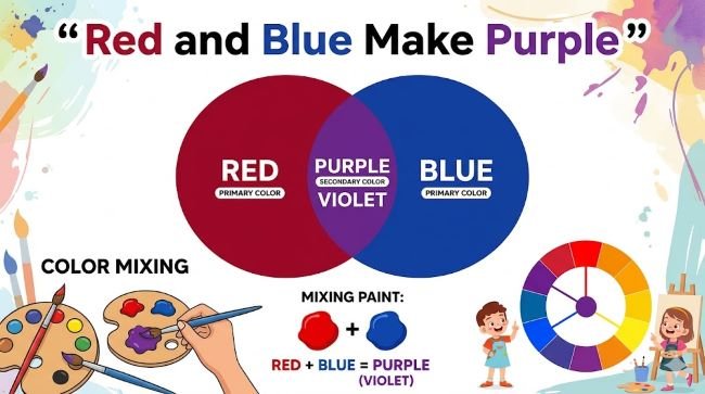
Red and blue make purple because purple sits between those two colors on the color wheel. In traditional subtractive color mixing (which is what happens when you mix paints or pigments), combining a warm and a cool primary produces a secondary color. Red plus blue equals purple. Red plus yellow equals orange. Yellow plus blue equals green.
That’s the theory. The real-world result depends on which red and which blue you’re using, because not all reds and blues are equal. Every paint pigment has a bias, meaning it leans slightly toward another color. A red that leans toward orange (like Cadmium Red) carries some yellow in it. When you mix that with blue, the hidden yellow creates a grey or brown cast in the purple, dulling it.
The same problem happens with blue. A blue that leans toward green (like Cerulean) will bring that green bias into the mix, again pushing the purple toward neutral rather than vivid.
What Two Colors Make Purple? The Best Combinations
To get a clean, vibrant purple, you want a red and a blue that both lean toward each other on the color wheel rather than away from it.
The most reliable combinations:
- Ultramarine Blue + Alizarin Crimson: This is the classic painter’s combination for a rich, deep purple. Ultramarine leans red-violet, and Alizarin Crimson leans blue-red. Neither brings yellow or green into the mix, so the purple comes out clean.
- Dioxazine Purple + any red or blue: Dioxazine is a pre-mixed purple pigment used as a base. Adding red shifts it warmer; adding blue shifts it cooler.
- Quinacridone Magenta + Phthalo Blue: A vivid combination that produces intense, jewel-toned purples closer to violet.
Combinations to avoid if you want a clean purple:
- Cadmium Red + Cerulean Blue: Both carry opposing biases (yellow and green). The result is usually a dull, muted purple.
- Any red with a strong orange cast mixed with a blue with a strong green cast: The hidden yellow from both sides compounds and pushes the result toward brown or grey.
What Colors Make Purple Lighter or Darker
Once you have a base purple, adjusting its value (how light or dark it is) works the same way as with any color.
To make it lighter, add white. This produces a lavender or lilac tone. The more white you add, the softer and more pastel the result. Be aware that some pigments shift in hue when white is added, so test as you go.
To make it darker, add more of your blue, or use a small amount of black. Adding blue deepens the purple while keeping it cool. Black darkens it but can also neutralize the vibrancy, so use it sparingly.
To warm the purple up, lean more red into the mix. To cool it down, lean more blue.
Red and Blue Make What Color in Light vs Pigment
It’s worth knowing that color mixing in light works differently than in pigment.
In pigment (paint, ink, dye), you’re working with subtractive mixing. Colors absorb wavelengths of light, and mixing pigments together subtracts more wavelengths, making the result darker. Red and blue make purple.
In light, you’re working with additive mixing. Screens, LEDs, and projectors use this system. In additive mixing, red and blue light combined produce magenta, not purple. True purple is harder to produce in light because it falls between red and violet, and violet requires very short wavelengths that standard RGB screens don’t produce with a single light source. Screens approximate purple by blending red and blue light, but what they produce technically lands in the magenta range.
This distinction matters if you’re working in design or digital art. What you see as purple on screen is an RGB approximation, and it may look different when printed depending on how the printer’s CMYK values map to that screen color.
Using Purple in Design
Purple carries strong associations across cultures: royalty, creativity, mystery, spirituality, and luxury. The specific shade shifts those associations considerably.
A deep, dark purple reads as premium and authoritative. A bright violet reads as creative and energetic. A soft lavender reads as gentle and feminine. A muted, grayed purple reads as sophisticated or melancholy depending on context.
Typography set in purple on a dark background can feel theatrical or editorial. On white, it works well for beauty, wellness, and lifestyle brands. The color is versatile enough to serve multiple moods depending on value and saturation.
For design projects where you’re working with purple as a brand color or dominant palette element, looking at how purple-adjacent typefaces and color systems interact can sharpen your instincts. The Coconat font with its soft, rounded letterforms, for example, pairs naturally with lavender and lilac palettes in wellness and lifestyle contexts. For something with more edge, a geometric sans like Mont holds its own against deeper, more saturated purples in premium or editorial design.
Key Takeaways
- Red and blue make purple in subtractive (pigment) color mixing.
- The shade of purple depends on which red and blue you use. Pigment biases determine whether the result is vibrant or dull.
- For clean, vivid purple, use Ultramarine Blue and Alizarin Crimson. Avoid combinations where both pigments carry opposing biases.
- Lighten purple with white, darken with blue or small amounts of black, warm with more red, cool with more blue.
- In light (additive mixing), red and blue produce magenta, not purple. Screens approximate purple using RGB blending.
- In design, purple’s associations shift significantly with value and saturation: dark reads premium, bright reads creative, soft reads gentle.


